Pages

Showing posts with label illustration. Show all posts

Saturday, February 6, 2016

Make Art That Sells Home Decor - Week 1 & 2

At the beginning of this year I made a promise to myself to work as illustrator and improve my craft. I made a commitment to up my game with my marketing skills to get regular work as an artist illustrating books and products like cards, journals, fabric and who knows what else. It's a great big world out of there for artists who are working to make a living. And more importantly I wanted to marry together my world of beads and art - playing back and forth between the two with similar themes.

I signed up for Lilla Roger's Make Art That Sells Home Decor course a few weeks ago and just jumped in, pushing aside fears and focusing on making art that I love. I have been sneaking in moments early in the morning, painting in my evenings and even a few hours late into the night. I like to start each day with my sketch book and brush pens before heading into the bead studio.

The first week of the class was intimidating. You are taking the class with some amazing professional artists.

But Lilla is part art agent, part art instructor and part art psychologist!

She is so encouraging and knows how to take all those overwhelming feelings and channel it into productive lessons and energy.

There was a huge learning curve for me in the beginning trying to mock up my artwork into home decor items that could be made of metal. (The first one shown above is actually a redo of my assignment that I submitted.) It was a clunky attempt but I'm giving myself time to learn - that's why we take classes, right - to learn not to be experts as soon as we start.

This week was much easier. The painting is my favorite part and I jumped in creating several main images and lots of smaller accents to use in my fabric product mock ups. I wanted to capture the feeling of my summers here in Michigan with Queen Anne's Lace, chicory and monarch butterflies. Some things were happy accidents but that's okay. After a week I am getting the hang of the basics of using Photoshop to transform my illustrations into these fun designs.


After scanning in all my art work and cleaning it up I realized I had enough for two themes with the butterflies for one set and one featuring wildflowers in country chic containers. 

We have three weeks left in the class and then it will be time for the Make Art That Sells Bootcamp and then I am signed up to take Lilla's self-paced MATS A course that focuses on 5 of the top selling art markets. Thankfully time management and learning to work quicker are part of the course! 

Friday, August 15, 2014

Make It In Design Summer School

A few weeks ago I started the online course offered by Make It In Design called Summer School. It's a trend and inspiration brief sent out every two weeks, there are three different tracks and since I'm a very green beginner in the world of surface design I'm taking the beginner track. Our first week was Tropical Paradise.  I was digging pineapples and zeroed in on them. I worked in mixed media using pencil, watercolor pencils and gouache. 

My goal in making the art for this course is creating designs that I would want to wear, have in my home or give as a gift.  I'm not a whiz at mocking things up so I have these in my Society 6 shop and borrowed the photos from there! 

The fun part of the brief is that it's all trendy items and that has inspired me in my day job - making beads and jewelry.  So here is a pineapple bracelet that I made for myself! I had never really thought of myself as a pattern designer, but I realized I make patterns all the time - they are just in clay rather than on paper.  So working in clay first for each assignment has been a fun a way to find inspiration. 

Tiny pineapple charms.

The second brief was on tribal patterns and I wanted to work with color and texture for this design. The feather pattern was inspired by African prints. I wanted to create more of a collection that would work together so I worked up three patterns in the same color palette and graphic line quality. These were created with Copic markers and oil pastels. 

Here are the three designs and products from my Society 6 shop.  You can also get prints of each of these designs there too. I really think I need to order that big on the top for myself!

And to start this assignment I started with the clay and made beads. This design actually inspired the drawings in both color and pattern. I've wanted to create beads that had that a tribal vibe for a while because it's super trendy in the jewelry world right now, so bonus result of the class!

You can see the galleries and read more about the Make It In Design programs on their website here.

Monday, January 13, 2014

I Just Like to Make Things too!

I have been spending my weekends and evenings sketching and painting since the New Year.  Seeing yet another year pass where I didn't chase after my dreams got to me this year. Enough to make some serious changes in my schedule.  In fact, right now my job is just make stuff, as much stuff as possible, as quickly as possible and have fun doing it.  If it's not good enough yet, it will be soon because eventually I will find my stride, I will develop my language in paint and pen.  Just like I did with block printing. I am jumping in and doing my job, making and submitting. I'm out to find my joy and that's some serious business and there is no time to waste!

I bought the book, I Just Like to Make Things by Lila Rogers for my Kindle the other day, I'm thinking I may need to order a real copy of it soon! (Sometimes that happens when I buy an artsy book, I need to hold it in my hands!) I just started reading it and it's already kicking my brain into gear and has me super excited about illustrating, painting and playing!

Has the new year brought a new resolve for your career?

Friday, September 10, 2010

Building a Visual Vocabulary


In keeping with my no short-cut theme, I have been working hard on building a visual vocabulary in my sketchbook.  I've ordered a few really cute kids clothes catalogs and have been sketching the wee folk and their stylish duds.  Of course the trick is to change their facial expressions to give them some life, no we don't want kids looking like they crawled out of a JC Penny catalog. 

You can't really abstract something until you know it - you have to be able to draw proportions and have a hint of truth in simplified or stylized drawing of kids.  So while these will never be anything more than exercises in observation they are an important step in improving my drawing skills.  It also helps me expand my idea of what kids are wearing and improve upon my small stable of hairstyles.

Of course drawing from life is great too, but good luck getting a toddler to sit for any longer than a doodle!

Thursday, September 9, 2010

No Shortcuts

I know this is such a late conference review - like a month late.  I have been traveling, working on our upcoming local conference and working away on my jewelry book.  Deadlines - aren't they awesome fun?

I've been thinking about what I'd like to share about the 2010 Summer SCBWI conference.  I could give you a round-up of quotes, photos of folks I met, epiphanies that dawned on me.  But you've already read all of that on the SCBWI Blog and from your favorite bloggers.  What I will share is what is still rattling around in my brain a month later.  What has caused a little paradigm shift for me after the conference?

It's one line from agent Steven Malk, "There are no short cuts."  Now he was talking about trends and quick fixes.  But the more those words have settled in my brain, the more I realize what great advice that one-liner is.

There are no short cuts to creating great illustrations. 
Am I sketching everyday? 
Am I working on more than one solution to a problem in my thumbnail sketches?  (Thanks to E.B. Lewis' breakout session that is a question I'm asking myself more and more.)
Am I taking the principles of design and color seriously as I work up my images?
Am I studying the masters in this field, the classics of the genre and what is hitting and flying off the shelves?
Am I finishing projects/dummies that have been on my to-do list forever? 

There are no short cuts to getting published.
What have I submitted this month? 
Is my mailing list current?
Do I have a plan for my next postcard?
Note to self: you must join a critique group again, asap!

There are no short cuts to self-promotion.
Frequent website updates.
Blog and share new work more often.
Use social networking for networking and not just lurking.
Be honest about my efforts - is it promoting or procrastinating?
Am I keeping up with my marketing plan or just making fancy lists?

An agent is not a short-cut to publication.
Getting an agent is not a quick fix but a partnership to grow your career.  Ever grow anything?  It takes hard work, (skill) lots of weeding (editing, critiques), sunshine and water (inspiration) and time.  Well that's just it, it all takes time.

There are no short-cuts. Sometimes it may seem like someone has caught a lucky break, but honestly those are rare and yeah for them.  For most illustrators it takes a few years to learn the ropes, hone their skills and find their way before they make it.  This has helped with some of my own frustration over the 'why not me' feelings and 'oh if I only didn't have a day job rants.' Just me?  Okay, maybe that's just me.

Friday, May 21, 2010

My Process

I thought I'd share a little behind the scenes of what goes into my illustrations. 

Everything starts as a sketch, usually a pretty small one, that is scanned, enlarged and flipped in Photoshop.  The printmaking process is in reverse, so to save my sanity I simply flip it backwards in Photoshop and print it out to transfer to my blocks.  It can be a little tricky wrapping my brain around the reserve image, as you'll see later!

Some prints I carve everything on one block and print the entire block.  For this image, I decided to create the image in a series of 'stamps'.  For the background, I cut a little square and used a stencil of the owl.  After that I created belly stencil and did the flower print.  The owl and words were also created with as stamps and printed on the image. 

Here you can see the print before the owl.  If you missed the print, you can see it here:

Now, printmaking may see like a scary process - but there is an 'undo' button.  If I make a mistake I simply carve out the part and make a stamp that replaces it.  As in the 'a' that I carved the wrong way. So there you have, one way I make my artwork. 

Wednesday, May 19, 2010

Question Everything


New piece I worked up today.  4 color blockprint.  Liking this new stuff.  I'll show more of the process later this weekend - I took photos!

Tuesday, May 18, 2010

Illustration Friday: Equipment

 Equipment needed for the best smelling laundry ever:

1. clothesline
2. clothespins
3. gentle breeze (use country air for best results)
4. sunshine
5. a few hours

My entry for this week's Illustration Friday.

Mono print and block print with some hand-coloring.

Sunday, May 16, 2010

Zazzle Dazzle

One of the topics covered in the ecourse I recently took was using print-on-demand companies to sell your image on different products.  I have quite a stash of images I used for promotional postcards that are available for me to use and resell.  How Zazzle works - you select the royalty you want to get for each product, the copyright still belongs to you, so your image is safe.  After you upload the images, you create products and a store.  So here is my shop, filled with goodies!  It's something to try, I mean why should all these beautiful images sit collecting dust on my hard drive when they could be out in the world making kids cute! You can even create shoes.

My next goal is to offer prints in my etsy shop.  Do you have your illustration in a Zazzle or CafePress shop?

Monday, April 26, 2010

Just for Fun

Hmm, my life often resembles a circus. 

This was a fun piece to whip up over the weekend. A little looser and primitive in style than I usually do, but whimsical and aimed at a younger crowd.

What else did I do this weekend?  Why I updated my portfolio:

What do you think of the hand-lettering.  I worry, are there rules to hand-lettering that I'm not following?  Is there some secret designer font rules I'm breaking?  Or is it just a free-for-all-do-whatever-the-heck-you-want kind of deal?  I suppose I could plead ignorance and then we can call it outsider art.  Oh wait, that trusty art degree negates that.  I better do my research on the matter then...

Monday, April 19, 2010

Foxy New Work

I had it in mind since August to play around with printing in two colors for a bit of a retro feel to my work.  I finally sat myself down to experiment this weekend.  Here is my first go at it and I'm pretty excited.  I carved two plates for this illo, one that I printed in green and other the brown line work.

I added in a few touches of color after the image was printed with my trusty oil pastels.  I have to say, I'm quite smitten with foxes at the moment.  Now to work up a few more samples in this style.

Here is the sketch, in case you like to see the process. 

Monday, February 1, 2010

Back to Basics

Or maybe the title of this post should be, "Mind your basic design principles, young padawan." Okay, that's probably something a Jedi Knight wouldn't utter, but it is something that should be on your mind if you want to pull viewers into your work on a all sorts of levels like visually, emotionally as well as through the narrative.


I had the privilege of sitting in on a talk by two-time Caldecott Honor winner Marla Frazee at the Austin SCBWI conference this weekend. She showed us examples of using those design elements to portray emotions in your illustrations. She is brilliant and this gentle reminder of getting back to the basics to tell the story visually was inspiring.

Her talk was on Storytelling Tools and Techniques. She reviewed:

Artist's Voice/Style
Charactization
Setting
Interpretation of Text
Sequential Action
The Page Turn
Format - Size and Layout Options

She encouraged us to be aware of each choice we make in an illustration and how that can impact telling the story. She tries to get at the heart of the text to find what emotions need to be portrayed in each scene.

Want a refresher on those basic design principles? Here is a good link with all sorts of resources.

Friday, November 20, 2009

Flashback Friday


Another one from the Humblearts vault. 

I really love this piece. I created it as an example for an illustration with a poem a few years ago.  This is based on a farm near my dad's house.  And the barn does say Breezy Hill, who wouldn't want to live there?  It's so sweet and old fashioned.  And yeah, I have a thing for snow. Of course I do, I'm in the middle of Texas with not a hint of cold weather for weeks to come!

And high-five for me for week three of blogging here at the new Humblearts Journal!

Enjoy your weekend.

Thursday, November 19, 2009

Grow Your Illustration Business


Okay, this blog post is for me. Sometimes I need to give myself a little advice. Maybe it will be helpful to someone else, so here it is:

1. Don't focus on the past. Put your energy toward moving ahead and reaching your next goal.
2. Work this business like you do your day job.
3. Study the best children's books, read them, all of them and school thy self on what makes a fantastic picture book and art for children.
4. Have written goals and a marketing plan.
5. Work everyday toward those goals. Even if it is sketching or updating your mailing list for 15 minutes. 
6. Be honest about your work, does it wow? If not, get busy improving and exploring!
7. Be Flexible. Do you only work in one medium? Do you have black and white samples in your portfolio? Does your work only cover one age group? Can you add another section to your portfolio to expand your target audience?
8. Make your own work while you wait for new assignments.  Get creative.

Monday, November 16, 2009

Illustration Friday - Unbalanced


Looks like there might be some layoffs in Santa's workshop this year!
Check out Illustration Friday to see the rest of this week's entries.
(Traditional block print, hand-colored with oil pastels and pastel pencil.)

Thursday, November 12, 2009

Fairy Tales


Pulled from the Humblearts archives. 
Hmm, I may have to work on some more lettering, that was fun stuff.
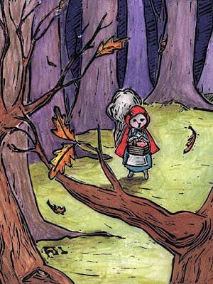
Run jack run!

Need to work on your porfolio?
Take 3 classic fairy tales and illustrate 3 scenes from each one to tell the story:
1. Illustrate one for the board book market - simple shapes, bright colors, easy to read.  Here is a tip, the character size doesn't change in a board book. 
2. Illustrate one for the picture book market, which is usually 3-6 years old.  Only put a twist on the fairy tale, mix it up, place the story in an unlikely setting, etc.
3. Illustrate one in an early chapter book style - black and white, for 1st-3rd grade.  Bonus points if you create a mock-up cover for the fairy tale chapter book.

Tuesday, November 10, 2009

New Work


Brown or black ink?  Bright colors or muted? 
Let me know what you think!

Tuesday, November 3, 2009

21 Day Marketing Plan


Nothing like the excitement of a new project to get my creativity rolling.  I love the beginning of projects, when all possibilities are open and the road is yet traveled.  So here we start Humblearts Journal on blogger. I've had my blog for a few years but over the last two years it's been beyond neglected. My old computer is not a fan of typepad and I'm over here blogging almost everyday anyway for my beady empire.

So what shall we start with?  A list and a plan for November.  I'm giving a presentation at our next SCBWI meeting on Marketing for Authors and Illustrators.  So I need to practice what I'll be teaching and preaching.  I'm great at the knowing, not so good at the doing!

Daily:
twitter/facebook/blog - keep up with what's going on in the industry, get my name & work out there.
Update my mailing list for 15 minutes day.

Week One:
Create new blog
Update website with new work
New promo image

Week Two:
Work on 2 new dummy samples
Send out postcards
Outline for craft book proposal

Week Three:
Send out dummy
Write query letter
Marketing research for craft book proposal

Bite size, specific and with a deadline.  Now that's how you set a goal.  (Illustrator quakes in boots, must stay consistent...)